App Config Reference
Schema Properties
The two properties $schema and schemaVersion should always be present in an app.json file.
{
  "$schema": "..\\..\\ViewerFramework\\app-config\\mobile\\mobile-app-config.schema.json",

  "schemaVersion": "1.0",

  "items": [...]
}
The $schema property powers the Visual Studio intellisense in the app.json file for the various properties that each app item has. The app.json included with the Quickstart references a schema at the root of the project. If you move an app.json file, you will need to fix the relative path to the schema file. For more information on json schemas, see json-schema.org.
The ViewerFramework folder containing the schema will not be created until an initial build is complete.
The schemaVersion property is a required property that informs VertiGIS Studio Mobile what version of app config you are using. This allows for the schema to be updated in future releases without breaking old configuration.
App Items
An app config file is composed of a list of app items. App items can potentially be anything. Each app item has an item $type, which viewer is aware of and knows how to locate and load. They usually they represent configuration for components, maps, portal items, or shared data. All item app configuration is specified within the items array of the app.json file.
Each component can only load a certain $type of app item which corresponds to it. For example, <map> components can only load app items of type map-extension as their configuration.
Custom App Items
App items in VertiGIS Studio Mobile correspond to a class that extends VisualAppItem and registers with Autofac as an AppItem type, like the CustomComponentConfiguration in the app config tutorial.
VertiGIS Studio Mobile uses Autofac to register, locate, and inject components, services and other classes. See dependency injection for more info.
[assembly: AppItem(CustomComponentConfiguration.ConfigItemtype, typeof(CustomComponentConfiguration))]
namespace App1.Configuration
{
    public class CustomComponentConfiguration : VisualAppItem
    {
        public const string ConfigItemtype = "custom-component-config";

        ... // config properties, etc

    }
}
Registering a class in this manner makes mobile aware of a new app item type, which can be added to the items list in the app.json with the appropriate $type specified. Components can consume these app items, and by extension, the configuration. Check out component configuration models for more details.
Item URIs and Resource URIs
Item URIs are a commonly used pattern in the app.json to uniquely identify and reference app items. They take the format
item://<item-type>/<item-id>
For example, the item URI for the following item is item://menu-item/measureAction
{
  "$type": "menu",
  "id": "feature-actions",
  "items": [...]
}
These item URIs can be used by app items to include other app items as property values, allowing reuse.
{
    "$type": "feature-details",
    "id": "feature-details",
    "featureActions": "item://menu/feature-actions"
}
Resource URIs are used to load layouts in VertiGIS Studio Mobile. Layout files are added to VertiGIS Studio Mobile as an asset which is copied into the end users local data folder. These copied assets are referenced with a URI of the format
resource://layout-<size>.xml
For example, here's references to a small, medium, and large layout in the app.json
{
  "schemaVersion": "1.0",
  "items":[
    ...
    {
        "$type": "layout",
        "id": "desktop-layout",
        "url": "resource://layout-large.xml",
        "tags": ["mobile", "large"]
    },
    {
        "$type": "layout",
        "id": "tablet-layout",
        "url": "resource://layout-medium.xml",
        "tags": ["mobile", "medium"]
    },
    {
        "$type": "layout",
        "id": "handheld-layout",
        "url": "resource://layout-small.xml",
        "tags": ["mobile", "small"]
    }
    ...
  ]
}
Reusing Config
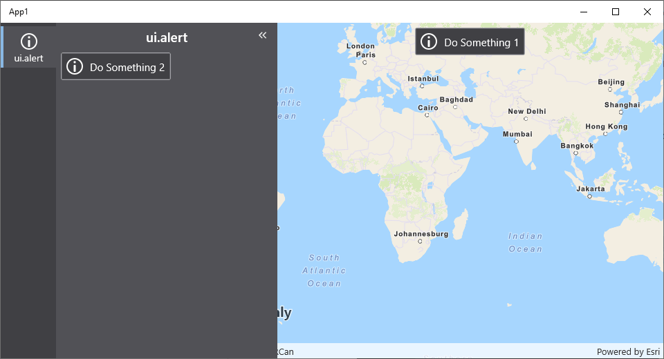
The same config can be used for multiple items in a layout. For example, this allows you to reuse the same button in multiple locations in the App.
- Layout
- App Config
- User Interface
<?xml version="1.0" encoding="utf-8" ?>
<layout xmlns="https://geocortex.com/layout/v1"
        xmlns:gxm="https://geocortex.com/layout/mobile/v1">
  <gxm:taskbar orientation="vertical">
    <panel grow="1">
        <stack margin="0.5">
          <button icon="info" config="do-something" slot="top-center-visible" margin="0.5">Do Something 2</button>
        </stack>
    </panel>
    <map slot="main">
      <button icon="info" config="do-something" slot="top-center-visible" margin="0.5">Do Something 1</button>
    </map>
  </gxm:taskbar>
</layout>
{
    "schemaVersion": "1.0",
    "items": [
        {
            "$type": "layout",
            "id": "desktop-layout",
            "url": "resource://layout-large.xml",
            "tags": ["mobile", "large"]
        },
        {
            "$type": "menu-item",
            "id": "do-something",
            "title": "ui.alert",
            "isEnabled": true,
            "iconId": "info",
            "action": {
                "name": "ui.alert",
                "arguments": {
                    "title": "Something?",
                    "message": "Fine, I did it",
                    "buttonText": "OK"
                }
            }
        }
    ]
}

Internationalization
All language strings used for properties in the app config, like "title" or "description", are automatically translated by the application.
Learn more about how to use and create language resources.
{
    "schemaVersion": "1.0",
    "items": [
        ...
        {
            "$type": "menu-item",
            "id": "zoom-to-extent",
            "iconId": "zoom-extent",
            "title": "language-zoom-extent-title",
            "description": "language-zoom-extent-description",
            "action": "map.zoom-to-layer-extent"
        },
        ...
    ]
}