App Config
Check out the Key Concepts.
While layouts depict the visual structure of how components are going to appear in the viewer, app config is used to define the functional structure within a given component.
-
Think of the app config as the structural materials for building a house (wood, bricks, etc.) and the layout as the blueprints for the house.
-
The materials are the fundamental building blocks that create the house itself, and the blueprints allow for them to be structured together into something that people can interact with.
Every component within the viewer that requires functional, compositional content needs to be configured within the viewer's corresponding app config.
Check out the Quickstart and edit the default app config and layout.
Anatomy of an App config
An app config file is composed of a list of app items. App items can potentially be anything. Each app item has an item $type, which viewer is aware of and knows how to locate and load. They usually they represent configuration for components, maps, portal items, or shared data. All item app configuration is specified within the items array of the app.json file.
Each component can only load a certain $type of app item which corresponds to it. For example, <map> components can only load app items of type map-extension as their configuration.
Linking Layout to App Config
Every component in the layout can be linked to app config with the config attribute. The config attribute is used to identify the item in the app config that has configuration for the component.
If you do not provide a config attribute for a component, VertiGIS Studio Mobile will attempt to infer a default value.
- Layout
- App Config
<?xml version="1.0" encoding="utf-8" ?>
<layout xmlns="https://geocortex.com/layout/v1">
    <map config="my-map-config" />
</layout>
{
    "schemaVersion": "1.0",
    "items": [
        {
            "$type": "map-extension",
            "id": "my-map-config",
            "onInitialized": [
                {
                    "name": "ui.alert",
                    "arguments": {
                        "message": "Hello World"
                    }
                }
            ]
        }
    ]
}
Targeting Components by ID
Every component can also have an id attribute. The id attribute uniquely identifies a component within a layout and allows app items to target the component. The ID can be used by commands like ui.activate to target components, or by commands like run.workflow to target a host container component to display workflow UI within.
- Layout
- App Config
- User Interface
<?xml version="1.0" encoding="utf-8" ?>
<layout xmlns="https://geocortex.com/layout/v1"
        xmlns:gxm="https://geocortex.com/layout/mobile/v1"
        xmlns:xsi="http://www.w3.org/2001/XMLSchema-instance"
        xsi:schemaLocation="https://geocortex.com/layout/v1 ../../ViewerSpec/layout/layout-mobile.xsd">
    <gxm:taskbar orientation="vertical" id="taskbar">
        <map config="default" slot="main">
            <button icon="info" config="run-workflow" slot="top-center-visible" margin="0.5">Run Workflow in Taskbar</button>
            <button config="open-dialog" slot="bottom-center-visible" margin="0.5">Open Dialog</button>
        </map>
    </gxm:taskbar>
    <dialog id="dialog" active="false">
        <panel>
            <button icon="info" config="run-workflow" slot="top-center-visible" margin="0.5">Run Workflow in Taskbar</button>
        </panel>
    </dialog>
</layout>
{
    "schemaVersion": "1.0",
    "items": [
        {
            "$type": "map-extension",
            "id": "default"
        },
        {
            "$type": "layout",
            "id": "desktop-layout",
            "url": "resource://layout-large.xml",
            "tags": ["mobile", "large"]
        },
        {
            "$type": "workflow",
            "id": "demo-workflow",
            "title": "Demo Workflow",
            "target": "#taskbar",
            "portalItem": "c3964768dfa84fe5acf7a72ef95dc92b"
        },
        {
            "$type": "menu-item",
            "id": "run-workflow",
            "title": "run.workflow",
            "isEnabled": true,
            "iconId": "info",
            "action": {
                "name": "workflow.run",
                "arguments": {
                    "id": "demo-workflow"
                }
            }
        },
        {
            "$type": "menu-item",
            "id": "open-dialog",
            "title": "Open Dialog",
            "isEnabled": true,
            "iconId": "",
            "action": {
                "name": "ui.activate",
                "arguments": "dialog"
            }
        }
    ]
}
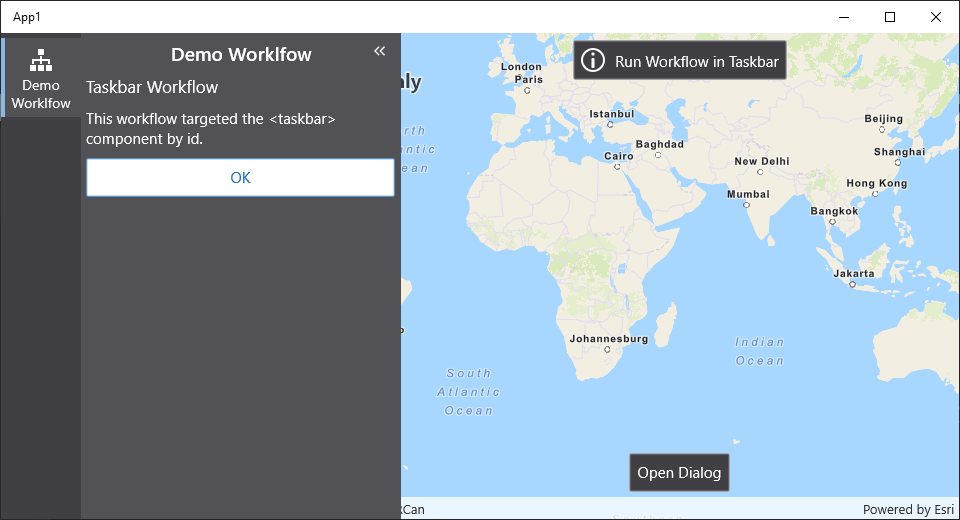
This example uses commands and operations to power its behavior.
Example: Basic App Config with IWTM
The I Want To Menu (IWTM) gets its functional structure from the app (list items and their functionalities) and its visual structure from the layout.
In the following example, the app structures a menu with one button, and the layout creates the IWTM button in the viewer and populates its contents with the corresponding 'menu' item in the app.
- App Config
- Layout
- User Interface
{
    "schemaVersion": "1.0",
    "items": [
        {
            "$type": "layout",
            "id": "desktop-layout",
            "url": "resource://layout-large.xml",
            "tags": ["mobile", "large"]
        },
        {
            "$type": "menu",
            "id": "iwtm",
            "items": [
                {
                    "title": "Refresh App",
                    "isEnabled": true,
                    "iconId": "sync",
                    "action": "app.refresh"
                },
                {
                    "title": "Display Debug Console",
                    "isEnabled": true,
                    "iconId": "debug",
                    "action": ["debug-console.display"]
                }
            ]
        }
    ]
}
<?xml version="1.0" encoding="utf-8" ?>
<layout
    xmlns="https://geocortex.com/layout/v1"
    xmlns:gxm="https://geocortex.com/layout/mobile/v1"
    xmlns:xsi="http://www.w3.org/2001/XMLSchema-instance"
    xsi:schemaLocation="https://geocortex.com/layout/v1 ../../ViewerSpec/layout/layout-mobile.xsd">
  <gxm:taskbar id="taskbar" orientation="vertical">
    <!-- Taskbar main content -->
    <map slot="main">
      <stack margin="0.8" slot="top-right" halign="end">
        <iwtm config="iwtm" >
          <user slot="bottom"/>
        </iwtm>
      </stack>
    </map>
  </gxm:taskbar>
</layout>
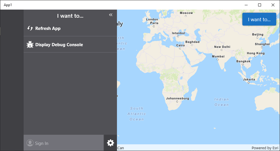
The <iwtm> Component in the layout is bound to the IWTM configuration by the attribute config="iwtm", where iwtm corresponds to the ID of the IWTM configuration. All components can be bound to config in this manner, and multiple components can be bound to the same configuration.
Each app item has a different $type and different configurable properties associated with it. The example application has two items in the app config:
- A layout
$typeitem which serves as a default layout and references alayout-*.xmlfile - A menu
$typeitem which provides config for the I Want To Menu in the layout
The functionality of the config attribute is dependent on the fact that IDs across app items of the same type are unique. That is, two items of types layer-extension and map-extension can both have the ID default, but two items of the same type layer-extension cannot have the same ID default.
Relevant SDK Samples
The VertiGIS Studio Mobile SDK Samples project has a variety of app configuration samples:
Next Steps: Commands and Operations
This example demonstrated a simple application which has a single menu, but the pattern of loosely coupling layout components with items in app config can allow you to build powerful apps with multiple layouts for different form factors and use cases. What we didn't cover in this example was how the menu items are powered. How can we make a menu item, and more generically, a button press or other app interaction, power actions in the application? The answer is to link app items to commands and operations.
Commands and Operations
Learn about Commands and Operations and how to configure them.
App Config Reference
Learn more about what you can accomplish with app config.