Build a Custom Component with UI
Did you know VertiGIS Studio Workflow allows you to create custom forms you can present to an end user?
Implementing a custom component in VertiGIS Studio Web gives you one of the highest degrees of flexibility with what you can do in VertiGIS Studio Web. Components can display custom, dynamic UI, register command and operation implementations, store persistent data, and more. They are also one of the most complex ways of customizing your VertiGIS Studio Web app, so it's worthwhile to try simpler options like changing the default behavior or VertiGIS Studio Workflow first.
By the end of this article, you'll have the knowledge to build a component that displays relevant news items at the top of your map.
Prerequisites
- Download and setup the VertiGIS Studio Web SDK.
- Check out the deployment instructions to learn more about deploying custom code to a VertiGIS Studio Web App.
Create a Component Skeleton
The first thing we need to do is create the necessary files for a custom component. Every component needs an associated model that extends ComponentModelBase.
Create a new folder structure with the following files. These files define a new component with a simple visual structure and export it from the CustomComponent folder.
src/components/CustomComponent/CustomComponent.tsxsrc/components/CustomComponent/CustomModel.tssrc/components/CustomComponent/index.ts
- Component
- Model
- Component Index
import React from "react";
import {
    LayoutElement,
    LayoutElementProperties,
} from "@vertigis/web/components";
import { CustomModel } from ".";

export default function CustomComponent(
    props: LayoutElementProperties<CustomModel>
) {
    return (
        <LayoutElement {...props}>
            <div>I'm so custom</div>
        </LayoutElement>
    );
}
import {
    ComponentModelBase,
    serializable,
} from "@vertigis/web/models";

@serializable
class CustomModel extends ComponentModelBase {}

export default CustomModel;
export { default } from "./CustomComponent";
export { default as CustomModel } from "./CustomModel";
Register the Component with the Web SDK
Every component needs to be registered with the Web SDK in order to be used in the layout
- Add new calls to
registerComponentandregisterModelinsrc/index.ts.
One key thing to note about this snippet is the itemType. The value of the item type is what links a component to a model. It's also the string value used for the $type property when defining configuration for a component.
import CustomComponent from "./components/CustomComponent"
...

export default function(registry: LibraryRegistry) {
    ...
    registry.registerComponent({
        name: "my-component",
        namespace: "your.custom.namespace",
        getComponentType: () => CustomComponent,
        itemType: "custom-component-model",
        title: "Custom Component",
    });
    registry.registerModel({
        getModel: (config) => new CustomModel(config),
        itemType: "custom-component-model",
    });
    ...
}
Add the Component to your Layout
To allow layout to find your component, you need to add the custom namespace of your component defined in the previous step with an xmlns tag to the layout.'
<?xml version="1.0" encoding="UTF-8"?>
<layout xmlns="https://geocortex.com/layout/v1"
        xmlns:custom="your.custom.namespace">
    <map/>
</layout>
You can then add the component itself to your layout, making sure to use name defined when registering the component in src/index.ts.
<?xml version="1.0" encoding="UTF-8"?>
<layout xmlns="https://geocortex.com/layout/v1"
xmlns:custom="your.custom.namespace">
    <map/>
    <custom:my-component/>
</layout>
If you run the development server you should see your custom component up and running.
Build out your Component's UI
Now that we have a working component, you can build out the UI experience just as you would with any other React Component.
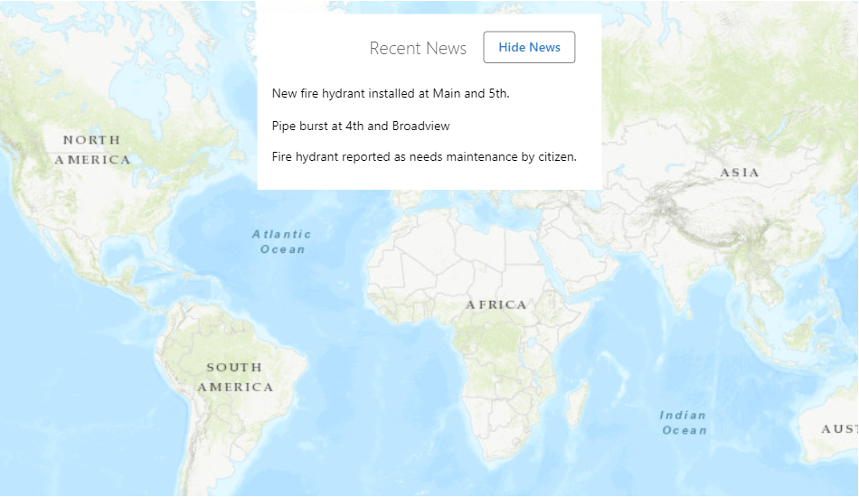
This React component displays a list of "news items" relevant to your GIS application in a hovering component at the top of the map. In a real application, these news items would be populated by an RSS feed or another news source.
This example uses VertiGIS Studio Web layout components
- Component
- Model
- Css
- Component Index
- Registration
- Layout
- UI
import React, { useState } from "react";
import {
    LayoutElement,
    LayoutElementProperties,
} from "@vertigis/web/components";
import List from "@vertigis/web/ui/List";
import ListItem from "@vertigis/web/ui/ListItem";
import TitleBar from "@vertigis/web/ui/TitleBar";
import Button from "@vertigis/web/ui/Button";
import DialogActions from "@vertigis/web/ui/DialogActions";
import "./NewsFeed.css";
import { NewsFeedModel } from ".";

export default function NewsFeed(
    props: LayoutElementProperties<NewsFeedModel>
) {
    const [hidden, setHidden] = useState(false);

    const newsItems: string[] = [
        "New fire hydrant installed at Main and 5th.",
        "Pipe burst at 4th and Broadview",
        "Fire hydrant reported as needs maintenance by citizen.",
    ];

    return (
        <LayoutElement {...props}>
            <List className="news-item-list">
                <DialogActions>
                    <TitleBar text="Recent News"></TitleBar>
                    {hidden && (
                        <Button onClick={() => setHidden(false)}>
                            Show News
                        </Button>
                    )}
                    {!hidden && (
                        <Button onClick={() => setHidden(true)}>
                            Hide News
                        </Button>
                    )}
                </DialogActions>
                {!hidden &&
                    newsItems.map((news, idx) => (
                        <ListItem key={idx}>{news}</ListItem>
                    ))}
            </List>
        </LayoutElement>
    );
}
import {
    ComponentModelBase,
    serializable,
} from "@vertigis/web/models";

@serializable
class NewsFeedModel extends ComponentModelBase {}

export default NewsFeedModel;
.news-item-list {
    max-height: 200px;
    overflow: scroll;
}
<?xml version="1.0" encoding="UTF-8"?>
<layout xmlns="https://geocortex.com/layout/v1" xmlns:custom="your.custom.namespace">
    <map>
        <custom:news-feed slot="top-center"/>
    </map>
</layout>
export { default } from "./NewsFeed";
export { default as NewsFeedModel } from "./NewsFeedModel";
import NewsFeed, { NewsFeedModel } from "./components/NewsFeed";
import { LibraryRegistry } from "@vertigis/web/config";

export default function (registry: LibraryRegistry) {
    registry.registerComponent({
        name: "news-feed",
        namespace: "your.custom.namespace",
        getComponentType: () => NewsFeed,
        itemType: "news-feed-model",
        title: "News Feed",
    });
    registry.registerModel({
        getModel: (config) => new NewsFeedModel(config),
        itemType: "news-feed-model",
    });
}
Live Sample
Check out a live SDK sample that demonstrates implementing a custom component. You can also view our UI library sample that shows how to use some of the available VertiGIS Studio Web React UI components. These components allow you to take advantage of styled, well tested, UI components that already participate in the application theme.
Next Steps
Check out the Component Reference
Take a deep dive into components in the VertiGIS Studio Web SDK
Build a Component that Consumes Configuration
Build a component that consumes values the from app config