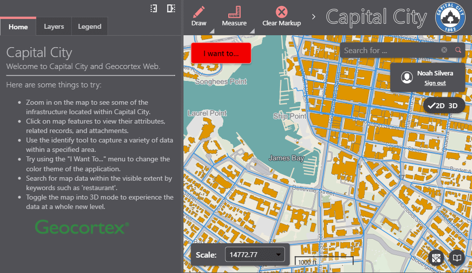
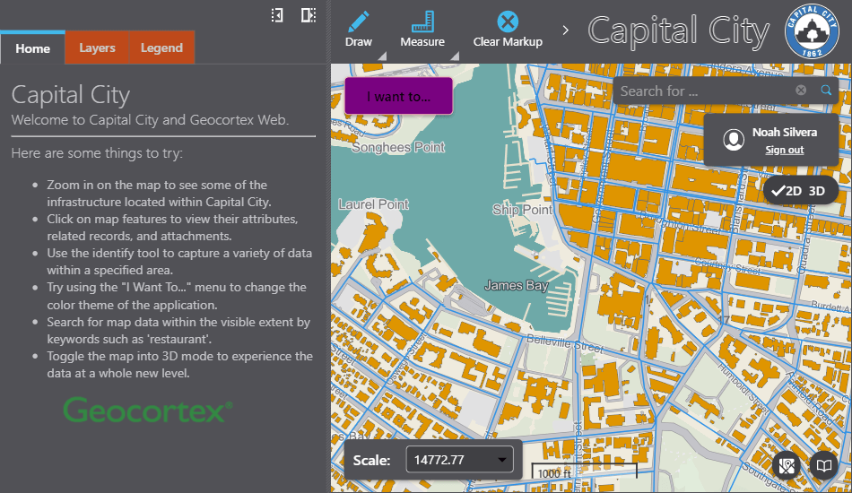
Configuring the Theme
VertiGIS Studio Web's appearance is built around two concepts: theme and layout. The theme controls the color scheme of the app, while the layout controls the organization of content.
Seeding a New Theme from an Existing Theme
Two predefined themes are included with VertiGIS Studio Web, light and dark. You can select a predefined theme and accent color with VertiGIS Studio Web Designer.
The branding service is responsible for the theming of the application. To select a theme and accent color from within the config, you can configure the branding service. The template property is used to specify the base theme to seed colors from.
- App Config
- UI
{
    "schemaVersion": "1.0",
    "items": [
        ...
        {
            "$type": "branding",
            "id": "branding",
            "activeTheme": "custom-vampire",
            "themes": [{
                "id": "custom-vampire",
                "accentColor": "red",
                "template": "dark"
            }]
        },
        ...
    ]
}
Customizing Theme Colors
Every color in a theme can be fully customized by editing the colors property of a theme in the branding service configuration.
Colors can be specified with their common name, a hex value, or a rgba value. A full list of all the color keys available in a theme can be found here.
- App Config
- UI
{
    "schemaVersion": "1.0",
    "items": [
        ...
        {
            "$type": "branding",
            "id": "branding",
            "activeTheme": "custom-vampire",
            "themes": [{
                "id": "custom-vampire",
                "accentColor": "red",
                "template": "dark",
                "colors": {
                    "emphasizedButtonBackground": "purple",
                    "primaryAccentLarge": "#00b7eb",
                    "secondaryBackground": [249, 77, 0, 255]
                }
            }]
        },
        ...
    ]
}
Theme Color Reference
Following is the interface that declares every possible theme color that can be used in a VertiGIS Studio Web Application. Each of these colors can be customized and used in custom components
You can inspect the CSS of a VertiGIS Studio Web Application to determine what theme property a specific element uses.
export interface BrandingColors {
    accentIconBackground: ColorConfig;
    accentIconBackgroundHover: ColorConfig;
    accentIconBorder: ColorConfig;
    accentIconBorderHover: ColorConfig;
    accentIconForeground: ColorConfig;
    accentIconForegroundHover: ColorConfig;
    alertAmberBackground: ColorConfig;
    alertAmberBackgroundHover: ColorConfig;
    alertAmberBorder: ColorConfig;
    alertAmberBorderHover: ColorConfig;
    alertAmberForeground: ColorConfig;
    alertAmberForegroundHover: ColorConfig;
    alertAmberIcon: ColorConfig;
    alertAmberIconHover: ColorConfig;
    alertGrayBackground: ColorConfig;
    alertGrayBackgroundHover: ColorConfig;
    alertGrayBorder: ColorConfig;
    alertGrayBorderHover: ColorConfig;
    alertGrayForeground: ColorConfig;
    alertGrayForegroundHover: ColorConfig;
    alertGrayIcon: ColorConfig;
    alertGrayIconHover: ColorConfig;
    alertGreenBackground: ColorConfig;
    alertGreenBackgroundHover: ColorConfig;
    alertGreenBorder: ColorConfig;
    alertGreenBorderHover: ColorConfig;
    alertGreenForeground: ColorConfig;
    alertGreenForegroundHover: ColorConfig;
    alertGreenIcon: ColorConfig;
    alertGreenIconHover: ColorConfig;
    alertRedBackground: ColorConfig;
    alertRedBackgroundHover: ColorConfig;
    alertRedBorder: ColorConfig;
    alertRedBorderHover: ColorConfig;
    alertRedForeground: ColorConfig;
    alertRedForegroundHover: ColorConfig;
    alertRedIcon: ColorConfig;
    alertRedIconHover: ColorConfig;
    alertBackgroundDisabled: ColorConfig;
    alertBorderDisabled: ColorConfig;
    alertForegroundDisabled: ColorConfig;
    alertIconDisabled: ColorConfig;
    buttonBackground: ColorConfig;
    buttonBackgroundDisabled: ColorConfig;
    buttonBackgroundHover: ColorConfig;
    buttonBorder: ColorConfig;
    buttonBorderDisabled: ColorConfig;
    buttonBorderHover: ColorConfig;
    buttonForeground: ColorConfig;
    buttonForegroundDisabled: ColorConfig;
    buttonForegroundHover: ColorConfig;
    buttonIcon: ColorConfig;
    buttonIconDisabled: ColorConfig;
    buttonIconHover: ColorConfig;
    disabledIconFill: ColorConfig;
    emphasizedButtonBackground: ColorConfig;
    emphasizedButtonBackgroundDisabled: ColorConfig;
    emphasizedButtonBackgroundHover: ColorConfig;
    emphasizedButtonBorder: ColorConfig;
    emphasizedButtonBorderDisabled: ColorConfig;
    emphasizedButtonBorderHover: ColorConfig;
    emphasizedButtonForeground: ColorConfig;
    emphasizedButtonForegroundDisabled: ColorConfig;
    emphasizedButtonForegroundHover: ColorConfig;
    emphasizedButtonIcon: ColorConfig;
    emphasizedButtonIconDisabled: ColorConfig;
    emphasizedButtonIconHover: ColorConfig;
    inlineTableHeaderBackground: ColorConfig;
    inlineTableRowBackground: ColorConfig;
    inlineTableBorder: ColorConfig;
    inputBorder: ColorConfig;
    itemSelectedBackground: ColorConfig;
    itemHoverBackground: ColorConfig;
    none: ColorConfig;
    panelBorder: ColorConfig;
    primaryAccent: ColorConfig;
    primaryAccentDisabled: ColorConfig;
    primaryAccentHover: ColorConfig;
    primaryAccentLarge: ColorConfig;
    primaryBackground: ColorConfig;
    primaryBorder: ColorConfig;
    primaryForeground: ColorConfig;
    primaryForegroundDisabled: ColorConfig;
    secondaryBackground: ColorConfig;
    secondaryBorder: ColorConfig;
    secondaryForeground: ColorConfig;
    tabPrimaryForeground: ColorConfig;
    tabSecondaryForeground: ColorConfig;
}