App Config
Check out the Key Concepts.
While layouts depict the visual structure of how components are going to appear in the viewer, app config is used to define the functional structure within a given component.
-
Think of the app config as the structural materials for building a house (wood, bricks, etc.) and the layout as the blueprints for the house.
-
The materials are the fundamental building blocks that create the house itself, and the blueprints allow for them to be structured together into something that people can interact with.
Every component within the viewer that requires functional, compositional content needs to be configured within the viewer's corresponding app config.
Download and setup the VertiGIS Studio Web SDK and edit the minimal layout and app config provided.
Anatomy of an App Config
An app config file is composed of a list of app items. App items can potentially be anything. Each app item has an item $type, which viewer is aware of and knows how to locate and load. They usually they represent configuration for components, maps, portal items, or shared data. All item app configuration is specified within the items array of the app.json file.
Each component can only load a certain $type of app item which corresponds to it. For example, <map> components can only load app items of type map-extension as their configuration.
Linking Layout to App Config
Every component in the layout can be linked to app config with the config attribute. The config attribute is used to identify the item in the app config that has configuration for the component.
If you do not provide a config attribute for a component, VertiGIS Studio Web will attempt to infer a default value.
- Layout
- App Config
- UI
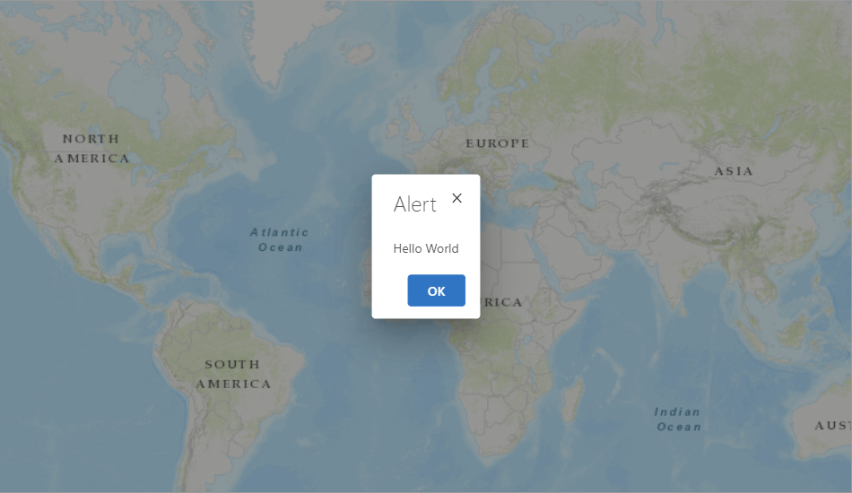
<?xml version="1.0" encoding="utf-8" ?>
<layout xmlns="https://geocortex.com/layout/v1">
    <map config="my-map-config"/>
</layout>
{
    "schemaVersion": "1.0",
    "items": [
        {
            "$type": "map-extension",
            "id": "my-map-config",
            "onInitialized": [
                {
                    "name": "ui.alert",
                    "arguments": {
                        "message": "Hello World"
                    }
                }
            ]
        }
    ]
}
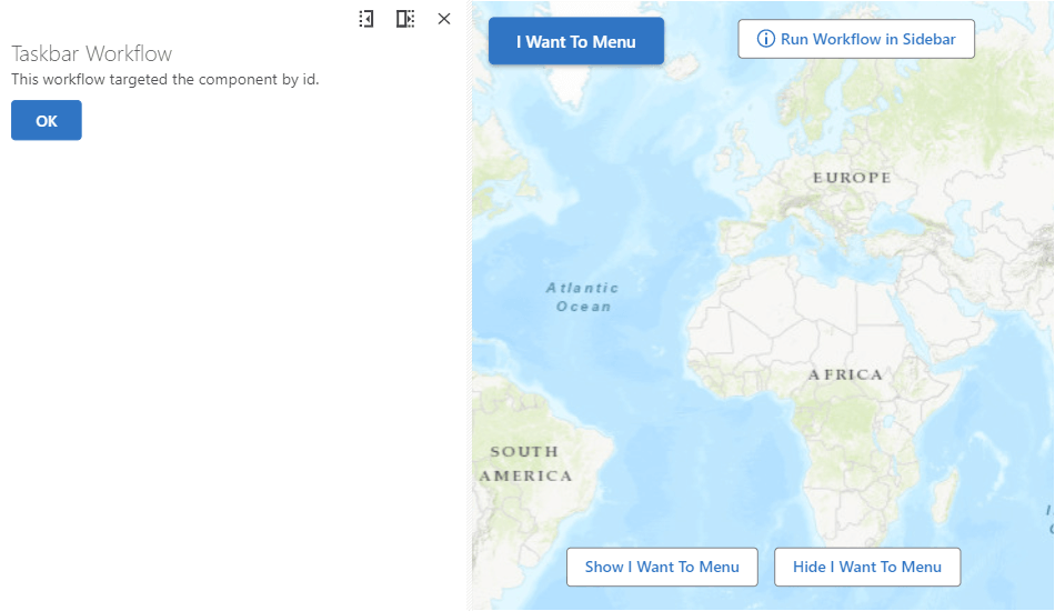
Targeting Components by ID
Every component can also have an id attribute. The id attribute uniquely identifies a component within a layout and allows app items to target the component. The ID can be used by commands like ui.activate to target components, or by commands like run.workflow to target a host container component to display workflow UI within.
This example uses commands and operations to power its behavior.
- Layout
- App Config
- UI
<?xml version="1.0" encoding="utf-8" ?>
<layout xmlns="https://geocortex.com/layout/v1">
    <split resizable="true">
        <panel width="30" active="true" id="main-panel"></panel>
        <map slot="main">
            <button icon="info" config="run-workflow" slot="top-center" margin="0.5">Run Workflow in Side Panel</button>
            <split slot="bottom-center">
                <button config="showIwtm" margin="0.5">Show I Want To Menu</button>
                <button config="hideIwtm" margin="0.5">Hide I Want To Menu</button>
            </split>
            <iwtm config="iwtm-config" slot="top-left" active="false" id="iwtm"/>
        </map>
    </split>
</layout>
{
    "schemaVersion": "1.0",
    "items": [
        {
            "$type": "workflow",
            "id": "demo-workflow",
            "title": "Demo Workflow",
            "target": "main-panel",
            "portalItem": "c3964768dfa84fe5acf7a72ef95dc92b"
        },
        {
            "$type": "menu-item",
            "id": "run-workflow",
            "title": "Run Workflow in Sidebar",
            "isEnabled": true,
            "iconId": "info",
            "action": {
                "name": "workflow.run",
                "arguments": {
                    "id": "demo-workflow"
                }
            }
        },
        {
            "$type": "menu-item",
            "id": "showIwtm",
            "title": "Show I Want To Menu",
            "isEnabled": true,
            "iconId": "",
            "action": {
                "name": "ui.activate",
                "arguments": "iwtm"
            }
        },
        {
            "$type": "menu-item",
            "id": "hideIwtm",
            "title": "Hide I Want To Menu",
            "isEnabled": true,
            "iconId": "",
            "action": {
                "name": "ui.deactivate",
                "arguments": "iwtm"
            }
        },
        {
            "id": "iwtm-config",
            "items": ["item://menu-item/run-workflow"],
            "title": "I Want To Menu",
            "$type": "menu"
        }
    ]
}
Example: Application with Hidden Side Panel
This example demonstrates a web application with a hidden side panel that pops out when you click a button. It was created entirely with app config and layout. Some advanced layout concepts and advanced app config concepts, such as linking config items through item URIs, were used.
- Layout
- App Config
- UI
<?xml version="1.0" encoding="UTF-8"?>
<layout xmlns="https://geocortex.com/layout/v1" xmlns:web="https://geocortex.com/layout/web/v1">
    <split resizable="true">
        <panel id="hidden-panel" show-close-button="true" width="50" active="false">
            <stack padding="2" halign="center" valign="center">
                <map id="small-map" config="small-map" grow="1" margin="4"/>
                <scalebar config="small-map-scalebar" grow="1" slot="bottom-left" models="#small-map"/>
                <button grow="1" config="zoom-both-maps"/>
                <split grow="1" valign="center">
                    <button grow="1" config="zoom-small-map"/>
                    <button grow="1" config="zoom-large-map"/>
                </split>
                </stack>
        </panel>
        <map id="large-map" config="large-map">
            <iwtm config="iwtm" slot="top-left"/>
            <compass slot="top-right"/>
            <expand slot="bottom-right" >
                <web:bookmarks />
            </expand>
            <web:scale-input slot="bottom-left" />
            <scalebar slot="bottom-left"/>
            <map-coordinates slot="context-menu"/>
        </map>
    </split>
</layout>
{
    "schemaVersion": "1.0",
    "items": [
        {
            "$type": "geocortex-web-viewer",
            "id": "default",
            "onInitialized": [
                {
                    "name": "ui.display-notification",
                    "arguments": {
                        "message": "Use the I Want To Menu to open up a hidden side panel."
                    }
                }
            ]
        },
        {
            "$type": "map-extension",
            "id": "small-map"
        },
        {
            "$type": "map-extension",
            "id": "large-map"
        },
        {
            "$type": "menu",
            "id": "iwtm",
            "items": [
                {
                    "$type": "menu-item",
                    "iconId": "open",
                    "title": "Open Hidden Side Panel",
                    "action": {
                        "name": "ui.activate",
                        "arguments": "hidden-panel"
                    }
                }
            ],
            "title": "I Want To Menu",
            "isLandmark": true
        },
        {
            "$type": "menu-item",
            "id": "zoom-both-maps",
            "title": "Zoom Both Maps In",
            "isEnabled": true,
            "iconId": "zoom",
            "action": {
                "name": "map.zoom-in",
                "arguments": {
                    "maps": [
                        "item://map-extension/small-map",
                        "item://map-extension/large-map"
                    ]
                }
            }
        },
        {
            "$type": "menu-item",
            "id": "zoom-small-map",
            "title": "Zoom Small Map Out",
            "isEnabled": true,
            "iconId": "zoom",
            "action": {
                "name": "map.zoom-out",
                "arguments": {
                    "maps": ["item://map-extension/small-map"]
                }
            }
        },
        {
            "$type": "menu-item",
            "id": "zoom-large-map",
            "title": "Zoom Large Map Out",
            "isEnabled": true,
            "iconId": "zoom",
            "action": {
                "name": "map.zoom-out",
                "arguments": {
                    "maps": ["item://map-extension/large-map"]
                }
            }
        },
        {
            "$type": "scalebar",
            "id": "small-map-scalebar",
            "showDualUnits": true
        }
    ]
}
Next Steps: Commands and Operations
This article demonstrated some simple examples of layouts with buttons that affect the map or other components in the UI. Commands and operations are the infrastructure which powers those behaviors, and power much of the behavior internal to VertiGIS Studio Web.
Commands and Operations
Learn about commands and operations and how to configure them
Create a Custom Theme
Learn how to create a custom theme using app config
Advanced App Config Topics
Learn more about what you can accomplish with app config