Component Styling
VertiGIS Studio Web provides a built-in library of professionally designed UI components, as well as options for custom styling. You can also take advantage of the built-in icons, or add your own.
Custom Styling
By using VertiGIS Studio Web layout components, you can take advantage of styled, well tested, UI components that already participate in the application theme.
- Component
- CSS
- UI
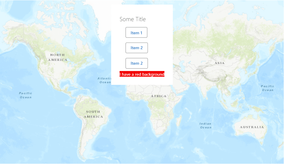
import React from "react";
import {
    LayoutElement,
    LayoutElementProperties,
} from "@vertigis/web/components";
import List from "@vertigis/web/ui/List";
import ListItem from "@vertigis/web/ui/ListItem";
import TitleBar from "@vertigis/web/ui/TitleBar";
import Button from "@vertigis/web/ui/Button";
import ExampleComponentModel from "./ExampleComponentModel";
import "./ExampleComponent.css";

export default function ExampleComponent(
    props: LayoutElementProperties<ExampleComponentModel>
) {
    return (
        <LayoutElement {...props}>
            <List dense={true}>
                <TitleBar>Some Title</TitleBar>
                <ListItem>
                    <Button>Item 1</Button>
                </ListItem>
                <ListItem>
                    <Button>Item 2</Button>
                </ListItem>
                <ListItem>
                    <Button>Item 2</Button>
                </ListItem>
                <div className="red">I have a red background</div>
            </List>
        </LayoutElement>
    );
}
.red {
    background-color: red;
    color: white;
}
However, if you need to manually theme the component, you can use the various theming colors in custom css, through the var(...) css function.
A full list of all the color keys available in a theme can be found here.
.my-element {
    background-color: var(--primaryBackground);
}
Component that Uses Built-in Icons
There are two ways to use icons in a component. If the component will always render the same icon, you can use an icon component.
import React, { FC } from "react";
import {
    LayoutElement,
    LayoutElementProperties,
} from "@vertigis/web/components";
import IconButton from "@vertigis/web/ui/IconButton";
import MenuItem from "@vertigis/web/ui/MenuItem";
import ListItemText from "@vertigis/web/ui/ListItemText";
import CloudDownload from "@vertigis/web/ui/icons/CloudDownload";
import ComponentWithIconModel from "./ComponentWithIconModel";

const ComponentWithIcon: FC<
    LayoutElementProperties<ComponentWithIconModel>
> = (props) => {
    return (
        <LayoutElement
            {...props}
            style={{ backgroundColor: "white" }}
        >
            <MenuItem>
                <ListItemText
                    primary={"Icon Example"}
                    secondary={"cloud-download icon"}
                />
                <IconButton title="IconExample">
                    <CloudDownload fontSize="large" />
                </IconButton>
            </MenuItem>
        </LayoutElement>
    );
};

export default ComponentWithIcon;
If the component doesn't know which icon it will need to render, you can use the DynamicIcon component instead, which takes in its icon ID as a prop.
import React, { FC } from "react";
import {
    LayoutElement,
    LayoutElementProperties,
} from "@vertigis/web/components";
import DynamicIcon from "@vertigis/web/ui/DynamicIcon";
import ComponentWithIconModel from "./ComponentWithIconModel";
import MenuItem from "@vertigis/web/ui/MenuItem";
import IconButton from "@vertigis/web/ui/IconButton";
import ListItemText from "@vertigis/web/ui/ListItemText";

const ComponentWithIcon: FC<
    LayoutElementProperties<ComponentWithIconModel>
> = (props) => {
    const { icon } = props.model;
    return (
        <LayoutElement
            {...props}
            style={{ backgroundColor: "white" }}
        >
            <MenuItem>
                <ListItemText primary="Custom Arrow Icon" />
                <IconButton title="Custom Arrow Icon">
                    <DynamicIcon src={icon} />
                </IconButton>
            </MenuItem>
        </LayoutElement>
    );
};

export default ComponentWithIcon;
Next Steps
Add Custom Icons
Learn how to add custom icons to a VertiGIS Studio Web Application