Build a Custom Component with UI
Did you know VertiGIS Studio Workflow allows you to create custom forms you can present to an end user?
Implementing a custom component in VertiGIS Studio Mobile gives you the highest degree of flexibility with what you can do. Components can display custom, dynamic UI, register operation implementations, store persistent data, and more. They are also one of the most complex ways of customizing your VertiGIS Studio Mobile app, so it might be worthwhile to review simpler options like Commands and Operations or Workflow first.
By the end of this article, you'll have the knowledge to build a component that displays a progress bar that is advanced by a button.
Prerequisites
Check out and setup the VertiGIS Studio Mobile SDK Quickstart project.
Create a Component Skeleton
Create a new file components/CustomComponent.cs under the platform agnostic project.
In the file, add a new component class CustomComponent and register it with Autofac.
using App1;
using App1.Components;
using VertiGIS.Mobile.Composition.Layout;
using System.Xml.Linq;

[assembly: Component(typeof(CustomComponent), "custom-component", XmlNamespace = XmlNamespaces.App1Namespace)]
namespace App1.Components
{
    class CustomComponent : ComponentBase
    {
        protected override VisualElement Create(XNode node)
        {
            return new Label(){ Text = "My Custom Component" };
        }
    }
}
Add the Component to your Layout
First, the layout needs to be told where to find your component. In the assembly attribute of the CustomComponent, we declared it to be part of the App1Namespace which is defined in XmlNamespaces.cs We need to add this xml namespace as an attribute on the layout. In this example, it's added with the alias custom.
<?xml version="1.0" encoding="utf-8" ?>
<layout
    xmlns="https://geocortex.com/layout/v1"
    xmlns:gxm="https://geocortex.com/layout/mobile/v1"
    xmlns:xsi="http://www.w3.org/2001/XMLSchema-instance"
    xsi:schemaLocation="https://geocortex.com/layout/v1 ../../ViewerSpec/layout/layout-mobile.xsd"
    xmlns:custom="https://your.org/layout/app1">
    <gxm:taskbar>
        <map slot="main"/>
    </gxm:taskbar>
</layout>
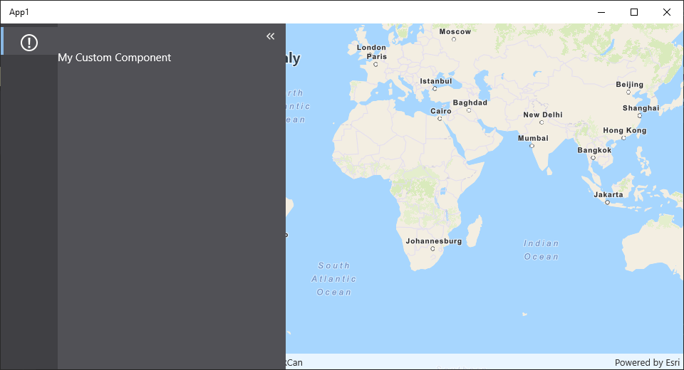
Now that the custom namespace has been added, the component can be added to the layout. For this example, it was added into a Panel that lives in the taskbar.
- Layout
- User Interface
<?xml version="1.0" encoding="utf-8" ?>
<layout
    xmlns="https://geocortex.com/layout/v1"
    xmlns:gxm="https://geocortex.com/layout/mobile/v1"
    xmlns:xsi="http://www.w3.org/2001/XMLSchema-instance"
    xsi:schemaLocation="https://geocortex.com/layout/v1 ../../ViewerSpec/layout/layout-mobile.xsd"
    xmlns:custom="https://your.org/layout/app1">
    <gxm:taskbar>
        <!--Taskbar / custom component-->
        <panel>
            <custom:custom-component icon="info"/>
        </panel>
        <map slot="main"/>
    </gxm:taskbar>
</layout>
Use XAML to define your UI
XAML is a markup language created by Microsoft, and one of the recommended patterns for defining UI in MAUI. We can modify our component to reference a XAML View.
- Right click on the
Componentsfolder and select "Add" > "New Item" > "Content View" - Rename the files and classes within to
CustomComponentView.xamlandCustomComponentView.xaml.cs - Modify the
CustomComponentto return this new view for its content.
- Component
- View
- Code Behind
- UI
using App1;
using App1.Components;
using VertiGIS.Mobile.Composition.Layout;
using System.Xml.Linq;

[assembly: Component(typeof(CustomComponent), "custom-component", XmlNamespace = XmlNamespaces.App1Namespace)]
namespace App1.Components
{
    class CustomComponent : ComponentBase
    {
        protected override VisualElement Create(XNode node)
        {
            return new CustomComponentView();
        }
    }
}
<?xml version="1.0" encoding="UTF-8"?>
<ContentView xmlns="http://schemas.microsoft.com/dotnet/2021/maui"
             xmlns:x="http://schemas.microsoft.com/winfx/2009/xaml"
             xmlns:mc="http://schemas.openxmlformats.org/markup-compatibility/2006"
             mc:Ignorable="d"
             x:Class="App1.Components.CustomComponentView">
  <ContentView.Content>
      <VerticalStackLayout>
          <Label Text="Hello world!" />
      </VerticalStackLayout>
  </ContentView.Content>
</ContentView>
using App1.Components;
using VertiGIS.Mobile.Composition;

[assembly: View(typeof(CustomComponentView))]
namespace App1.Components
{
    [XamlCompilation(XamlCompilationOptions.Compile)]
    public partial class CustomComponentView : ContentView
    {
        public CustomComponentView()
        {
            InitializeComponent();
        }
    }
}

Congratulations! You've built a working component with UI that is exposed in Mobile.
Learn about how to extend this component to participate in app config.
Extend your Component with Custom Code
From here, you can implement your own business logic and interfaces, create custom Commands and Operations that are powered by and/or interact with your component, and much more. The MAUI documentation has excellent guides to implementing user interfaces in Xaml.
VertiGIS Studio Mobile comes with built-in Enhanced Components that can ease development and styling of custom UI.
Example: Progress Bar
Here's an example of a component with a progress bar that is advanced on a button click. It uses a MVVM pattern to power the user interface, as is best practice recommended by Microsoft.
- Component
- View
- Code Behind
- View Model
- User Interface
using App1;
using App1.Components;
using VertiGIS.Mobile.Composition.Layout;
using System.Xml.Linq;

[assembly: Component(typeof(ProgressBarComponent), "progress-bar-component", XmlNamespace = XmlNamespaces.App1Namespace)]
namespace App1.Components
{
    class ProgressBarComponent : ComponentBase
    {
        private View _view;

        // The view is injected as a dependency
        public ProgressBarComponent(ProgressBarComponentView view)
        {
            _view = view;
        }
        protected override VisualElement Create(XNode node)
        {
            return _view;
        }
    }
}
<?xml version="1.0" encoding="UTF-8"?>
<ContentView xmlns="http://schemas.microsoft.com/dotnet/2021/maui"
             xmlns:x="http://schemas.microsoft.com/winfx/2009/xaml"
             xmlns:mc="http://schemas.openxmlformats.org/markup-compatibility/2006"
             mc:Ignorable="d"
             x:Class="App1.Components.ProgressBarComponentView">
    <ContentView.Content>
        <VerticalStackLayout Margin="20">
            <VerticalStackLayout Spacing="20" IsVisible="{Binding WorkNotComplete}">
                <Label Text="Click the button to advance the progress bar."></Label>
                <Button Text="Do some work." Clicked="DoWork_Clicked"></Button>
                <ProgressBar ProgressColor="Red" Progress="{Binding Progress}" />
            </VerticalStackLayout>
            <VerticalStackLayout Spacing="20" IsVisible="{Binding WorkComplete}">
                <Label  Text="Work Complete"></Label>
                <Button Text="Reset" Clicked="Reset_Clicked"></Button>
            </VerticalStackLayout>
        </VerticalStackLayout>
    </ContentView.Content>
</ContentView>
using App1.Components;
using VertiGIS.Mobile.Composition;
using VertiGIS.Mobile.Infrastructure.Messaging;
using System;

// Here, the view is registered with Autofac so it can be injected.
[assembly: View(typeof(ProgressBarComponentView))]
namespace App1.Components
{
    [XamlCompilation(XamlCompilationOptions.Compile)]
    public partial class ProgressBarComponentView : ContentView
    {
        private UIOperations _uiOperations;
        public ProgressBarComponentViewModel ViewModel => BindingContext as ProgressBarComponentViewModel;
        public ProgressBarComponentView(ProgressBarComponentViewModel viewModel, UIOperations uiOperations)
        {
            _uiOperations = uiOperations;
            BindingContext = viewModel;
            InitializeComponent();
        }

        private void DoWork_Clicked(object sender, EventArgs e)
        {
            if (!ViewModel.WorkComplete)
            {
                ViewModel.Progress += 0.2;
                if (ViewModel.Progress >= 1.0)
                {
                    ViewModel.WorkComplete = true;
                    _uiOperations.Alert.Execute(new UIAlertArgs() { Title = "Success", Message = "Work Complete", ButtonText = "Ok" });
                }
            }
        }

        private void Reset_Clicked(object sender, EventArgs e)
        {
            ViewModel.Progress = 0;
            ViewModel.WorkComplete = false;
        }
    }
}
using App1.Components;
using VertiGIS.Mobile.Composition;
using VertiGIS.Mobile.Composition.Views;

// Here, the view model is registered with autofac so it can be injected
[assembly: ViewModel(typeof(ProgressBarComponentViewModel))]
namespace App1.Components
{
    public class ProgressBarComponentViewModel : NotifyPropertyBase
    {
        private double _progress = 0;

        private bool _workComplete = false;

        public double Progress
        {
            get => _progress;
            set => SetProperty(ref _progress, value);
        }

        public bool WorkComplete
        {
            get => _workComplete;
            set
            {
                SetProperty(ref _workComplete, value);
                OnPropertyChanged(nameof(WorkNotComplete));
            }
        }

        public bool WorkNotComplete => !WorkComplete;
    }
}
This example refactored the original example to use Autofac dependency injection to instantiate the View and ViewModel. Setting up your classes so dependencies are handled by Autofac in the constructor allows you to allow inject other VertiGIS Studio Mobile classes registered with Autofac, like how the UIOperations class is injected into the view.
Learn more of this ViewModel's use of the VertiGIS Studio Mobile helper class NotifyPropertyBase.
Relevant SDK Samples
Check out the relevant VertiGIS Studio Mobile SDK Samples:
Next Steps
Component Reference
Learn more about components in VertiGIS Studio Mobile
Component and Service Interactions
Learn how components and services interact in VertiGIS Studio Mobile
Implement a Custom Service
Learn how to implement a custom service using the VertiGIS Studio Mobile SDK