Layout Reference
Autocomplete Properties
The layout-*.xml files that come with the Quickstart reference an xml schema. This XML schema allows Visual Studio to autocomplete property names and provide linting for types. Two attributes on the layout, xmlns:xsi, and xsi:schemaLocation allow this to happen. If you move the layout-*.xml files, you will need to adjust the relative reference to the layout schema for autocomplete to still function.
The ViewerFramework folder containing the schema will not be created until an initial build has been run.
<?xml version="1.0" encoding="utf-8" ?>
<layout
    xmlns="https://geocortex.com/layout/v1"
    xmlns:gxm="https://geocortex.com/layout/mobile/v1"
    xmlns:xsi="http://www.w3.org/2001/XMLSchema-instance"
    xsi:schemaLocation="https://geocortex.com/layout/v1 ../../ViewerSpec/layout/layout-mobile.xsd">
    ...
</layout>
Basic Attributes
This is a reference for the attributes available to all components in an app layout. All components support these attributes, as well as any custom attributes the component defines. Some of these attributes are accessible through the VertiGIS Studio Mobile Designer, and the rest can be configured through layout.
All attributes are specified as string values, and parsed into their respective types by VertiGIS Studio Mobile
<!-- string attribute -->
<stack id="some-id"/>
<!-- number attribute -->
<stack margin="3"/>
<!-- boolean attribute -->
<stack active="false"/>
id
Type: string
Description: Used to uniquely identify the component in the layout.
config
Type: string
Description: Used to bind a component to an item in the app config. See linking layout app config for more details.
active
Type: boolean
Description: Used to mark a component as initially active and visible.
Core Layout Components
The following is a reference for the main components used for visual organization in the layout.
All of these components are available for use in the VertiGIS Studio Mobile Designer.
Stacks and Splits
Stacks and splits are used to partition the viewer into rectangular sectors, each filled with whichever components you desire.
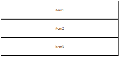
The best way to think of stacks is that every item within them is being ordered top to bottom:
<stack>
    <text text="item1"/>
    <text text="item2"/>
    <text text="item3"/>
</stack>
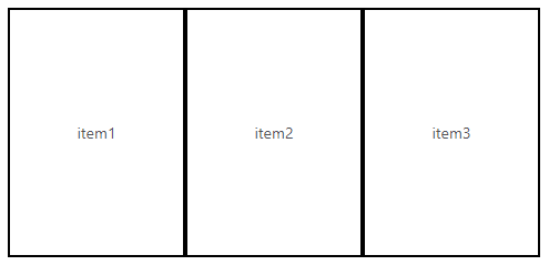
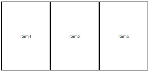
The best way to think of splits is that every item within them is being ordered left to right:
<split>
    <text text="item1"/>
    <text text="item2"/>
    <text text="item3"/>
</split>
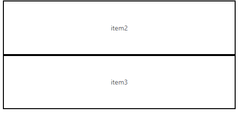
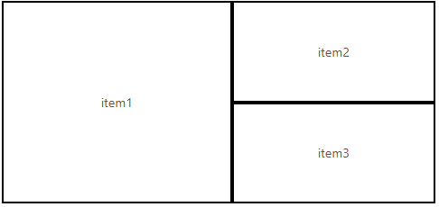
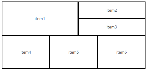
When creating complex layouts with embedded stacks and splits, it's good to picture building it from the inside out:
<stack>
    <split>
        <text text="item1"/>
        <stack>
            <text text="item2"/>
            <text text="item3"/>
        </stack>
    </split>
    <split>
        <text text="item4"/>
        <text text="item5"/>
        <text text="item6"/>
    </split>
</stack>
We start by building the first inner-most stack:
Then slot that into the split one level up:
We then build the next split:
And finally slot those two splits into the outer-most stack:
Panels
Panels are a container component that enable hierarchical navigation between different components.
- Layout
- Stack
- Feature Details
<panel>
    <stack>
        <search config="search"/>
        <results-list config="results" active="false" />
    </stack>
    <feature-details config="feature-details"/>
</panel>
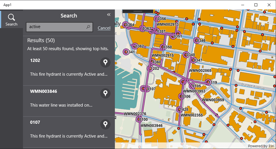
This search-panel has two root components:
- A stack containing a
<search>and a<results-list> - A
<feature-details>
When you first open the panel, the first component in the panel that is not explicitly set to active="false" is activated. In this example, it's the <stack> component containing a <search> and <results-list>.
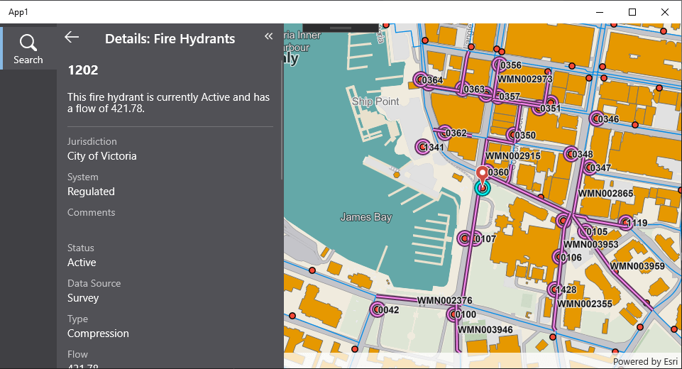
When a feature in the results list is opened, the <feature-details> component will be activated. At this point, the panel takes over the activation of the component. It will display the new component in the place of the existing component, and provide a back button to navigate to the previous component. The activation and deactivation algorithms for a panel rely on the concept of a stacking order of components laid on top of each other, with the first component being the bottommost, and the last being the topmost. In the example above, the <stack> containing <search> is the lowest, while the <feature-details> is the topmost.
Activation
- If the target component exists in the panel, then deactivate components above it until the target component is active
- Else, the target component must be deactivated, so activate it and place it above the existing component
Deactivation
- If the component is the topmost element (it is active), then deactivate it.
- Else, the component is already inactive
The default layout-large.xml in the VertiGIS Studio Mobile Quickstart has examples of multiple panels that live in the taskbar.
Taskbar
The taskbar is a major organizational element in VertiGIS Studio Mobile Apps. It provides an expandable menu designed for mobile form factors that hosts panels with dynamic content.
Every taskbar has a main slot, which hosts the primary content, usually a map.
- Layout
- User Interface
<?xml version="1.0" encoding="utf-8" ?>
<layout
    xmlns="https://geocortex.com/layout/v1"
    xmlns:gxm="https://geocortex.com/layout/mobile/v1"
    xmlns:xsi="http://www.w3.org/2001/XMLSchema-instance"
    xsi:schemaLocation="https://geocortex.com/layout/v1 ../../ViewerSpec/layout/layout-mobile.xsd">
  <gxm:taskbar id="taskbar" orientation="vertical">

    <!-- Taskbar main content -->
    <map slot="main"/>

  </gxm:taskbar>
</layout>
Items that live in the sidebar can be defined within the taskbar component, and typically consist of Panels containing other components, like a results list, or a workflow container.
- Layout
- User Interface
<?xml version="1.0" encoding="utf-8" ?>
<layout
    xmlns="https://geocortex.com/layout/v1"
    xmlns:gxm="https://geocortex.com/layout/mobile/v1"
    xmlns:xsi="http://www.w3.org/2001/XMLSchema-instance"
    xsi:schemaLocation="https://geocortex.com/layout/v1 ../../ViewerSpec/layout/layout-mobile.xsd">
  <gxm:taskbar id="taskbar" orientation="vertical">

    <!-- Taskbar main content -->
    <map config="map1" slot="main"/>

    <!-- Taskbar / search -->
    <panel>
      <stack id="search">
        <search config="search"/>
        <results-list config="results" active="false" />
      </stack>
      <feature-details config="feature-details"/>
    </panel>

    <!-- Taskbar / layers -->
    <panel id="layers">
      <layer-list />
    </panel>

    <!--Taskbar / workflow-->
    <panel>
      <workflow config="workflow" icon="workflow"/>
    </panel>
  </gxm:taskbar>
</layout>
Presentation Attributes
Components support a number of presentation attributes to adjust their positioning and styling in the application after slotting. Some of these presentation attributes are accessible through the VertiGIS Studio Mobile Designer, and the rest must be configured through layout.
All dimensional units are expressed in 'em's, where 1 em is equal to the current font size.
margin
Type: number
Description: Sets the size of the white space outside of the component.
Example:
<map margin="1.5"/> <!-- Sets the margin on a map to be equal to 1.5em. This would be 22.5 pts high if the current font size is 15 -->
padding
Type: number
Description: Sets the size of the white space between a component and its content.
Applies to: This attribute will only apply to components with children.
Example:
<stack padding="0.5"/> <!-- Sets the padding on a stack to be equal to 0.5em. This would be 7.5 pts high if the current font size is 15 -->
width
Type: number
Default value: If a width is not set, then the width shall be the natural width of the component or a dynamic size based on the grow and alignment attributes.
Description: Sets the width of a component.
height
Type: number
Description: Sets the height of a component.
Example:
<!-- Sets the width of a map to 30em, and the height to 20em. -->
<map width="30" height="20"/>
grow
Type: number
Description: Sets whether or not a component's width or height will grow over its parents primary axis. Components with a grow of 0 will fill to their natural or requested height. Components with a specified grow will fill up a percentage of the remaining space equal to their grow value divided by the total grow of all sibling components (including the component in question).
The default value for a component varies by component. For most components, if no grow value is specified, they will default to a grow value of "0". The following components however will have a default grow value of "1":
- Map
- Stack
- Split
Applies to: All components may specify this value, but it will only take effect if the component is a child of a split or a stack. For stacks, grow indicates how the child grows along the vertical axis. For splits, grow indicates how the child grows along the horizontal axis.
Example:
<stack>
    <!-- Heading will take up whatever vertical space it requires, and will occupy its natural width. -->
    <text content="Heading"/>
    <!-- The first map will occupy 1/3 of the remaining vertical space, and will occupy the full width available. -->
    <map grow="1"/>
    <!-- The first map will occupy 2/3 of the remaining vertical space, and will occupy the full width available. -->
    <map grow="2"/>
</stack>
halign (Horizontal Align)
Type: "start" | "center" | "end"
Description: Describes how the content of a component is aligned horizontally. For stacks and splits, the content is the child components. For a component like text, the content is the text itself.
valign (Vertical Align)
Type: "start" | "center" | "end"
Description: Describes how the content of a component is aligned vertically. For stacks and splits, the content is the child components. For a component like text, the content is the text itself.
Alignments Effect on cross-axis stretching
All components will stretch across the cross-axis if the corresponding alignment attribute (halign for stacks, valign for splits) is not set on the parent of that component. But if a cross-axis alignment is set, then they will no longer stretch across the cross axis (otherwise the effect of alignment would not be observed).
Some components will stretch across the cross-axis even if the cross-axis alignment is set on the parent: map, stack, split.