Customize the Theme
VertiGIS Studio Mobile's appearance is built around two concepts: theme and layout. The theme controls the color scheme of the app, while the layout controls the organization of content.
The theme can be partially configured by using the VertiGIS Studio Mobile Designer.
Prerequisites
Follow along by setting up the VertiGIS Studio Mobile SDK and editing the minimal layout and app config provided.
If you just need to make a small change to the layout and app config of an existing application, you can download the config and layout files for the application, tweak them, and then re-upload them.
Create a Basic App
Let's create a basic application with layout and config that we can theme.
- Layout
- App Config
{
    "$schema": "..\\..\\ViewerFramework\\app-config\\mobile\\mobile-app-config.schema.json",
    "schemaVersion": "1.0",
    "items": [
        {
            "$type": "layout",
            "id": "desktop-layout",
            "url": "resource://layout-large.xml",
            "tags": ["mobile", "large"]
        },
        {
            "$type": "map-extension",
            "id": "default",
            "onClick": [
                "tasks.identify",
                "results.display",
                "map.zoom-to-features"
            ],
            "webMap": "0ba877a4185448cb832af9a661031e31"
        },
        {
            "$type": "feature-details",
            "id": "feature-details",
            "onFeatureShow": "highlights.add-focus",
            "onFeatureHide": "highlights.remove-focus"
        },
        {
            "$type": "results",
            "id": "results",
            "onFeatureShow": [
                "highlights.add",
                {
                    "name": "panel.snap-host-panel",
                    "arguments": {
                        "userSet": true
                    }
                }
            ],
            "onFeatureRemove": "highlights.remove",
            "onAllFeaturesRemoved": [
                "panel.close-host-panel",
                "search.clear",
                "results.clear"
            ],
            "onFeatureClick": [
                "results.display-details",
                {
                    "name": "panel.snap-host-panel",
                    "arguments": {
                        "snapPosition": "middle"
                    }
                },
                "map.zoom-to-features",
                "highlights.pulse"
            ]
        }
    ]
}
<?xml version="1.0" encoding="utf-8" ?>
<layout
    xmlns="https://geocortex.com/layout/v1"
	xmlns:gxm="https://geocortex.com/layout/mobile/v1"
    xmlns:xsi="http://www.w3.org/2001/XMLSchema-instance"
    xsi:schemaLocation="https://geocortex.com/layout/v1 ../../ViewerSpec/layout/layout-mobile.xsd">
	<gxm:taskbar id="taskbar" orientation="vertical">
		<map config="default" slot="main"/>
		<panel>
			<results-list config="results" />
			<feature-details config="feature-details"/>
		</panel>
	</gxm:taskbar>
</layout>
Add Configuration for the Branding Service
Next, we are going to add an app item to configure the Branding Service, which manages application theming.
{
    "$schema": "..\\..\\ViewerFramework\\app-config\\mobile\\mobile-app-config.schema.json",
    "schemaVersion": "1.0",
    "items": [
        {
            "$type": "layout",
            "id": "desktop-layout",
            "url": "resource://layout-large.xml",
            "tags": ["mobile", "large"]
        },
        {
            "$type": "branding",
            "id": "branding"
        },
        {
            "$type": "map-extension",
            "id": "default",
            "onClick": [
                "tasks.identify",
                "results.display",
                "map.zoom-to-features"
            ],
            "webMap": "0ba877a4185448cb832af9a661031e31"
        },
        {
            "$type": "feature-details",
            "id": "feature-details",
            "onFeatureShow": "highlights.add-focus",
            "onFeatureHide": "highlights.remove-focus"
        },
        {
            "$type": "results",
            "id": "results",
            "onFeatureShow": [
                "highlights.add",
                {
                    "name": "panel.snap-host-panel",
                    "arguments": {
                        "userSet": true
                    }
                }
            ],
            "onFeatureRemove": "highlights.remove",
            "onAllFeaturesRemoved": [
                "panel.close-host-panel",
                "search.clear",
                "results.clear"
            ],
            "onFeatureClick": [
                "results.display-details",
                {
                    "name": "panel.snap-host-panel",
                    "arguments": {
                        "snapPosition": "middle"
                    }
                },
                "map.zoom-to-features",
                "highlights.pulse"
            ]
        }
    ]
}
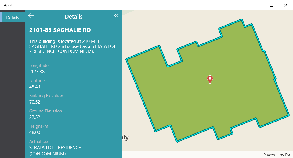
Add a New Theme
The branding service can be configured with a list of themes. Let's configure our branding service with a new theme with that has a custom background color.
You can customize the theme by changing any of the built-in color keys used for themes.
- App Config
- UI
{
    "$schema": "..\\..\\ViewerFramework\\app-config\\mobile\\mobile-app-config.schema.json",
    "schemaVersion": "1.0",
    "items": [
        {
            "$type": "layout",
            "id": "desktop-layout",
            "url": "resource://layout-large.xml",
            "tags": ["mobile", "large"]
        },
        {
            "$type": "branding",
            "id": "branding",
            "activeTheme": "custom-theme",
            "themes": [
                {
                    "id": "custom-theme",
                    "colors": {
                        "primaryBackground": [50, 153, 168, 255]
                    }
                }
            ]
        },
        {
            "$type": "map-extension",
            "id": "default",
            "onClick": [
                "tasks.identify",
                "results.display",
                "map.zoom-to-features"
            ],
            "webMap": "0ba877a4185448cb832af9a661031e31"
        },
        {
            "$type": "feature-details",
            "id": "feature-details",
            "onFeatureShow": "highlights.add-focus",
            "onFeatureHide": "highlights.remove-focus"
        },
        {
            "$type": "results",
            "id": "results",
            "onFeatureShow": [
                "highlights.add",
                {
                    "name": "panel.snap-host-panel",
                    "arguments": {
                        "userSet": true
                    }
                }
            ],
            "onFeatureRemove": "highlights.remove",
            "onAllFeaturesRemoved": [
                "panel.close-host-panel",
                "search.clear",
                "results.clear"
            ],
            "onFeatureClick": [
                "results.display-details",
                {
                    "name": "panel.snap-host-panel",
                    "arguments": {
                        "snapPosition": "middle"
                    }
                },
                "map.zoom-to-features",
                "highlights.pulse"
            ]
        }
    ]
}
Relevant SDK Samples
The VertiGIS Studio Mobile SDK Samples has an example of changing the theme through configuration.