Component Styling
VertiGIS Studio Mobile Components are styled using XAML styles. However, by using VertiGIS Studio Mobile Views, you can take advantage of styled, well tested, UI components that already participate in the application theme.
Using VertiGIS Studio Mobile Views
VertiGIS Studio Mobile Views, like the EnhancedButton or EnhancedSwitch, can ease the development of custom components with the SDK. Check out the relevant SDK sample for an end to end example of their use.
EnhancedButton
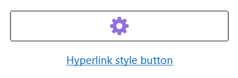
EnhancedButton is an extension of the MAUI Button, with some additional properties and functionality. These include Entered and Exited events for the cursor on UWP, additional color properties, and the ability to underline the button text.
<VerticalStackLayout>
    <toolkit:EnhancedButton ImageSource="cog" ImageTintColor="MediumPurple" HandCursorOnHover="True"/>
    <toolkit:EnhancedButton Text="Hyperlink style button" BorderWidth="0" TextUnderline="True"/>
</VerticalStackLayout>
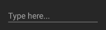
EnhancedEntry
EnhancedEntry is an extension of MAUI's Entry, with some additional theming on Android.
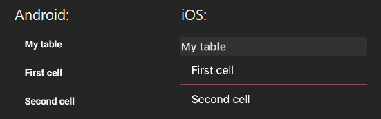
EnhancedTableView
EnhancedTableView is an extension of the MAUI TableView, with some additional color properties.
TintedImage
TintedImage is an extension of MAUI's Image which supports image tinting. Currently only supports FileImageSource sources.
<HorizontalStackLayout>
    <toolkit:TintedImage TintColor="DarkGoldenrod" Source="{Binding CogIcon, Converter={StaticResource IconConverter}, ConverterParameter='cog'}"/>
    <toolkit:TintedImage TintColor="MediumPurple" Source="{Binding CogIcon, Converter={StaticResource IconConverter}, ConverterParameter='cog'}"/>
</HorizontalStackLayout>

Using Theme Colors in Custom Components
If you need to use plain Views when building your component, the various theming colors can be used in XAML styling.
<Style x:Key="InnerDetailsFrameStyle" TargetType="Frame">
  ...
  <Setter Property="BackgroundColor" Value="{DynamicResource SecondaryBackgroundColor}"></Setter>
  ...
</Style>
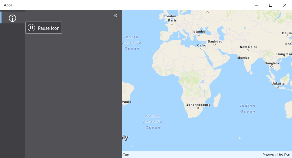
Using Built-in Icons
The following example demonstrates a component that uses VertiGIS Studio Mobile UI components and an icon from the VertiGIS Studio Icons library.
- Component
- UI
class CustomComponent : ComponentBase
{
    public CustomComponent()
    {
    }

    protected override VisualElement Create(XNode node)
    {
        return new EnhancedButton()
        {
            Text = "Pause Icon",
            ImageSource = "playback_pause",
            Margin = new Thickness(2)
        };
    }
}
Relevant SDK Samples
Check out the relevant VertiGIS Studio Mobile SDK Samples: