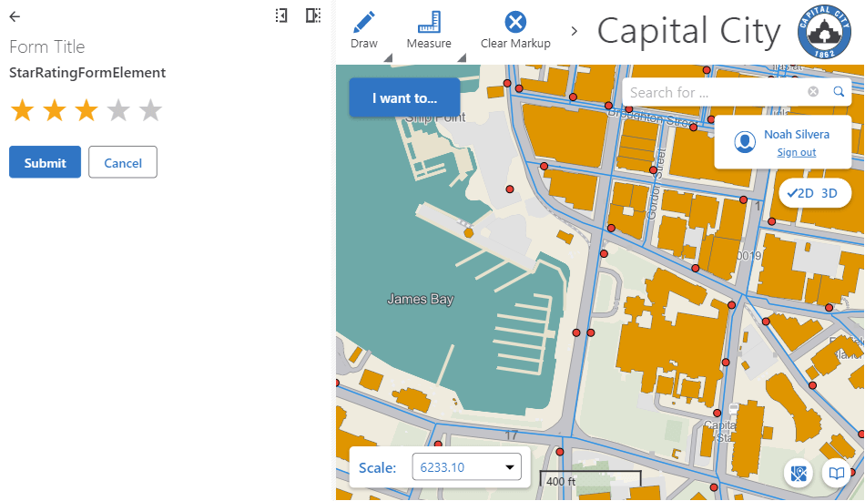
Implement a Star Rating Custom Form Element
Implementing a custom form element allows you to augment the existing form elements that come with VertiGIS Studio Workflow.
This article will walk you through creating a form element for rating that allows you to select up to five stars.

Prerequisites
Follow the instructions in the Web Applications SDK page to set up your development environment.
A working knowledge of TypeScript is recommended before extending Workflow for web-based hosts.
Custom workflow form elements are built in TypeScript and React.
Overview
Implementing a custom form element for web applications just involves creating the custom form element and implementing the UI.
Set up the Custom Form Element Skeleton
To create a new form element:
-
Open the Workflow activity SDK in Visual Studio Code.
-
Run
npm run generatein the terminal. -
When prompted, select
Form Element. -
Enter the name of the form element you would like to create and press
Enter. For example,StarRating. -
Open the newly created
src/elements/StarRating.tsxfile. -
Create a new file
StarRating.tsxin the activity SDK. -
Create a skeleton React form element.
import * as React from "react";
import {
    FormElementProps,
    FormElementRegistration,
} from "@vertigis/workflow";

interface StarRatingProps extends FormElementProps<number> {}

function StarRating(props: StarRatingProps): React.ReactElement {
    return <div>Hello. Is it me you're looking for.</div>;
}

const StarRatingElementRegistration: FormElementRegistration<StarRatingProps> =
    {
        component: StarRating,
        getInitialProperties: () => ({ value: 0 }),
        id: "StarRating",
    };

export default StarRatingElementRegistration;
Build the Star Rating UI
Next, we are going to build the form element to display the five stars the user can select. Form Elements are just React elements, and use React patterns to define their UI.
First, let's build the star DOM elements.
import * as React from "react";
import {
    FormElementProps,
    FormElementRegistration,
} from "@vertigis/workflow";

interface StarRatingProps extends FormElementProps<number> {}

function StarRating(props: StarRatingProps): React.ReactElement {
    const rating = 5;

    // Button style to show only the button content.
    const baseStyle: React.CSSProperties = {
        background: "none",
        border: "none",
        outline: "none",
        fontSize: "2em",
        padding: 0,
    };

    // Button styles to show selected and unselected states.
    const selectedStyle = { ...baseStyle, ...{ color: "#ffa91b" } };
    const unselectedStyle = { ...baseStyle, ...{ color: "#c6c6c6" } };

    // Create 5 buttons
    const buttons: JSX.Element[] = [];
    for (let i = 1; i <= 5; i++) {
        buttons.push(
            <button
                value={i}
                style={rating < i ? unselectedStyle : selectedStyle}
            >
                ★
            </button>
        );
    }

    return <div>{buttons}</div>;
}

const StarRatingElementRegistration: FormElementRegistration<StarRatingProps> =
    {
        component: StarRating,
        getInitialProperties: () => ({ value: 0 }),
        id: "StarRating",
    };

export default StarRatingElementRegistration;
Add Interactivity and Expose the Form Element's Value
Next, we are going to add interactivity to the form element to show how many stars the user has selected.
- Star Rating Form Element
- User Interface
import * as React from "react";
import {
    FormElementProps,
    FormElementRegistration,
} from "@vertigis/workflow";

interface StarRatingProps extends FormElementProps<number> {}
    const { setValue, value } = props;

    const handleClick = (event) => {
        // Get the value from the button.
        // Parse as an integer because the value is a string in the event.
        const newValue = parseInt(event.target.value);

        if (value !== newValue) {
            // Update the element's value.
            setValue(newValue);
        }
    };

    // Button style to show only the button content.
    const baseStyle: React.CSSProperties = {
        background: "none",
        border: "none",
        outline: "none",
        fontSize: "2em",
        padding: 0,
    };

    // Button styles to show selected and unselected states.
    const selectedStyle = { ...baseStyle, ...{ color: "#ffa91b" } };
    const unselectedStyle = { ...baseStyle, ...{ color: "#c6c6c6" } };

    // Create 5 buttons
    const buttons: JSX.Element[] = [];
    for (let i = 1; i <= 5; i++) {
        buttons.push(
            <button
                onClick={handleClick}
                value={i}
                style={value < i ? unselectedStyle : selectedStyle}
            >
                ★
            </button>
        );
    }

    return <div>{buttons}</div>;
}

const StarRatingElementRegistration: FormElementRegistration<StarRatingProps> =
    {
        component: StarRating,
        getInitialProperties: () => ({ value: 0 }),
        id: "StarRating",
    };

export default StarRatingElementRegistration;

Deploy the Form Element
Follow the instructions to build and deploy the activity pack.
Test the Form Element
Once your activity pack is hosted and registered, your custom form element should appear in the form element toolbox in VertiGIS Studio Workflow Designer alongside the built-in form elements, and can be used in the graphical interface like any other form element.
You can
download this demo workflow
that registers and displays the custom form element and then
import it into the VertiGIS Studio Workflow Designer.
You will have to
deploy the custom activity and form element
for it to function. This workflow assumes you are hosting the activity pack with the dev server on https://localhost:57999/.

Set the Form Element's Value at Runtime
Depending on the use case for the custom form element you may want to display it with an initial value that that is provided at runtime by the workflow. In the case of the Star Rating form element we may want to initially select four stars, or some number computed by the workflow.
To assign a value to a custom form element at runtime:
- Open your workflow in VertiGIS Studio Workflow Designer.
- Double-click the
Display Formactivity that contains the custom form element. - Select the custom form element.
- Expand the
Eventssection of the properties panel. - On the
loadevent clickAddorEdit. - Add a
Set Form Element Propertyactivity from the toolbox to the subworkflow. - Set the
Property Nameinput tovalue - Set the
Property Valueinput to an expression that assigns the desired value. For example:- Literal value:
4 - Variable value:
=$numberOfStars.result
- Literal value:
You can use the Set Form Element Property activity to assign a value to any prop of a custom form element React component.