Adding Icons
The VertiGIS Studio Web SDK supports adding custom icons to applications. Icon components are created with the createSvgIcon function. These icon components can then be registered to make them available to app config, layout, and other built-in web components.
To create a new SVG icon, create a new tsx file that exports the createSvgIcon function. This function will create a React component icon that can be used in VertiGIS Studio Web Components.
import createSvgIcon from "@vertigis/web/ui/icons/utils/createSvgIcon";
import React from "react";

export default createSvgIcon(
    <path d="M20 11H7.8l5.6-5.6L12 4l-8 8 8 8 1.4-1.4L7.8 13H20v-2z" />
);
You can then register this icon with the library using the registry.registerIcon(...) function. This allows it to be used in the app config, layout, and built-in web components like DynamicIcon, or Button.
Icon IDs should be chosen to be globally unique - one easy way to ensure this is to preface the icon ID with your company name.
- Registration
- Component With Icon
- Layout
- App Config
- UI
import { LibraryRegistry } from "@vertigis/web/config";
import ComponentWithIcon from "./components/ComponentWithIcon/ComponentWithIcon";
import ComponentWithIconModel from "./components/ComponentWithIcon/ComponentWithIconModel";
import CustomIcon from "./icons/CustomIcon";
const LAYOUT_NAMESPACE = "my.custom.namespace";

export default function (registry: LibraryRegistry): void {
    registry.registerComponent({
        name: "component-with-icon",
        namespace: LAYOUT_NAMESPACE,
        getComponentType: () => ComponentWithIcon,
        itemType: "component-with-icon-model",
        title: "Component With Icon",
    });
    registry.registerModel({
        getModel: (config) => new ComponentWithIconModel(config),
        itemType: "component-with-icon-model",
    });
    registry.registerIcon({
        id: "my-company-name-arrow",
        getComponentType: () => CustomIcon,
    });
}
import React, { FC } from "react";
import {
LayoutElement,
LayoutElementProperties,
} from "@vertigis/web/components";
import DynamicIcon from "@vertigis/web/ui/DynamicIcon";
import ComponentWithIconModel from "./ComponentWithIconModel";
import MenuItem from "@vertigis/web/ui/MenuItem";
import IconButton from "@vertigis/web/ui/IconButton";
import ListItemText from "@vertigis/web/ui/ListItemText";
const ComponentWithIcon: FC<
LayoutElementProperties<ComponentWithIconModel>
> = (props) => {
const { icon } = props.model;
return (
<LayoutElement
{...props}
style={{ backgroundColor: "white" }}
>
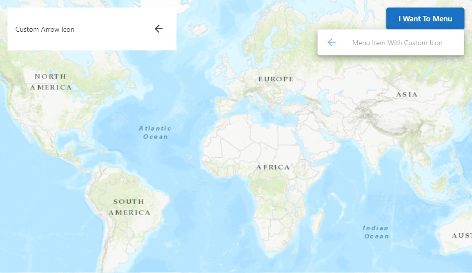
<MenuItem>
<ListItemText primary="Custom Arrow Icon" />
<IconButton title="Custom Arrow Icon">
<DynamicIcon src={icon} />
</IconButton>
</MenuItem>
</LayoutElement>
);
};
export default ComponentWithIcon;
{
    "schemaVersion": "1.0",
    "items": [
        {
            "$type": "layout",
            "id": "default",
            "title": "Default",
            "url": "./layout.xml"
        },
        {
            "$type": "component-with-icon-model",
            "id": "default",
            "icon": "my-company-name-arrow"
        },
        {
            "$type": "menu",
            "id": "iwtm-config",
            "title": "I Want To Menu",
            "items": [
                {
                    "$type": "menu-item",
                    "title": "Menu Item With Custom Icon",
                    "icon": "my-company-name-arrow"
                }
            ]
        }
    ]
}
<?xml version="1.0" encoding="UTF-8"?>
<layout xmlns="https://geocortex.com/layout/v1" xmlns:custom="my.custom.namespace">
    <map config="map-1">
        <custom:component-with-icon slot="top-left" width="22" height="5" config="default"/>
        <iwtm slot="top-right" config="iwtm-config" />
    </map>
</layout>
Next Steps
Use Icons in Components
Learn how to use icons in custom components