App Config Reference
schemaVersion property
The property schemaVersion should always be present in an app.json file.
{
  "schemaVersion": "1.0",

  "items": [...]
}
The schemaVersion property is a required property that informs VertiGIS Studio Web what version of app config you are using. This allows for the schema to be updated in future releases without breaking old configuration.
App Items
An app config file is composed of a list of app items. App items can potentially be anything. Each app item has an item $type, which viewer is aware of and knows how to locate and load. They usually they represent configuration for components, maps, portal items, or shared data. All item app configuration is specified within the items array of the app.json file.
Each component can only load a certain $type of app item which corresponds to it. For example, <map> components can only load app items of type map-extension as their configuration.
Custom App Items
Custom App items in VertiGIS Studio Web are most commonly defined by creating a configurable component model or a configurable service. Registering the model or service with VertiGIS Studio Web defines a new app item type which can be used in the app config.
Item URIs
Item URIs are a commonly used pattern in the app.json to uniquely identify and reference app items. They take the format
item://<item-type>/<item-id>
For example, the item URI for the following item is item://menu-item/feature-actions
{
  "$type": "menu",
  "id": "feature-actions",
  "items": [...]
}
These item URIs can be used by app items to include other app items as property values, allowing reuse.
{
    "$type": "feature-details",
    "id": "feature-details",
    "featureActions": "item://menu/feature-actions"
}
Reusing Config
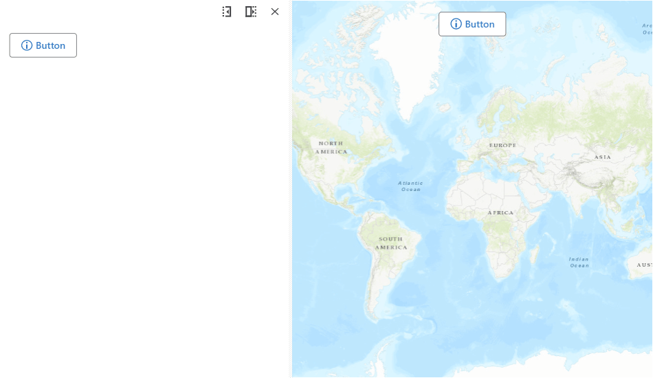
The same config can be used for multiple items in a layout. For example, this allows you to reuse the same button in multiple locations in the App.
- Layout
- App Config
- UI
<?xml version="1.0" encoding="utf-8" ?>
<layout xmlns="https://geocortex.com/layout/v1">
  <split resizable="true">
    <panel width="30">
        <stack margin="0.5">
          <button icon="info" config="do-something" margin="0.5" id="do-something-1"></button>
        </stack>
    </panel>
    <map slot="main">
      <button icon="info" config="do-something" slot="top-center" margin="0.5" id="do-something-2"></button>
    </map>
  </split>
</layout>
{
    "schemaVersion": "1.0",
    "items": [
        {
            "$type": "menu-item",
            "id": "do-something",
            "isEnabled": true,
            "iconId": "info",
            "action": {
                "name": "ui.alert",
                "arguments": {
                    "title": "Something?",
                    "message": "Fine, I did it",
                    "buttonText": "OK"
                }
            }
        }
    ]
}
In addition, multiple components can use the same configuration type. For example, components like the <iwtm>, <button> and <toolbar> all use the menu-item type in some manner for their configuration. Custom components can also adopt existing item types as their models.
Internationalization
All language strings used for properties in the app config, like "title" or "description", are automatically translated by the application.
Learn more about how to use and create language resources.
{
    "schemaVersion": "1.0",
    "items": [
        ...
        {
            "$type": "menu-item",
            "id": "zoom-to-extent",
            "iconId": "zoom-extent",
            "title": "language-zoom-extent-title",
            "description": "language-zoom-extent-description",
            "action": "map.zoom-to-layer-extent"
        },
        ...
    ]
}