Configuring the Theme
VertiGIS Studio Mobile's appearance is built around two concepts: theme and layout. The theme controls the color scheme of the app, while the layout controls the organization of content.
Customizing Theme Colors
Every color in a theme can be fully customized by editing the colors property of a theme in the branding service configuration.
note
Color properties are defined using an array of RGBA values.
- App Config
- UI
{
  "schemaVersion": "1.0",
  "items": [
    ...
    {
      "$type": "branding",
      "id": "branding",
      "activeTheme": "custom-theme",
      "themes": [
        {
        "id": "custom-theme",
        "colors": {
            "primaryBackground": [
              50,
              153,
              168,
              255
            ]
          }
        }
      ]
    },
    ...
  ]
}
Theme Color Reference
Following is a list of every possible theme color that can be used in a VertiGIS Studio Mobile Application. Each of these colors can be customized and used in custom components
note
Theme colors in mobile are added as dynamic resources.
Color accentIconBackground;
Color accentIconBackgroundHover;
Color accentIconBorder;
Color accentIconBorderHover;
Color accentIconForeground;
Color accentIconForegroundHover;
Color alertAmberBackground;
Color alertAmberBackgroundHover;
Color alertAmberBorder;
Color alertAmberBorderHover;
Color alertAmberForeground;
Color alertAmberForegroundHover;
Color alertAmberIcon;
Color alertAmberIconHover;
Color alertBackgroundDisabled;
Color alertBorderDisabled;
Color alertForegroundDisabled;
Color alertGreenBackground;
Color alertGreenBackgroundHover;
Color alertGreenBorder;
Color alertGreenBorderHover;
Color alertGreenForeground;
Color alertGreenForegroundHover;
Color alertGreenIcon;
Color alertGreenIconHover;
Color alertIconDisabled;
Color alertRedBackground;
Color alertRedBackgroundHover;
Color alertRedBorder;
Color alertRedBorderHover;
Color alertRedForeground;
Color alertRedForegroundHover;
Color alertRedIcon;
Color alertRedIconHover;
Color buttonBackground;
Color buttonBackgroundDisabled;
Color buttonBackgroundHover;
Color buttonBorder;
Color buttonBorderDisabled;
Color buttonBorderHover;
Color buttonForeground;
Color buttonForegroundDisabled;
Color buttonForegroundHover;
Color buttonIcon;
Color buttonIconDisabled;
Color buttonIconHover;
Color disabledIconFill;
Color emphasizedButtonBackground;
Color emphasizedButtonBackgroundDisabled;
Color emphasizedButtonBackgroundHover;
Color emphasizedButtonBorder;
Color emphasizedButtonBorderDisabled;
Color emphasizedButtonBorderHover;
Color emphasizedButtonForeground;
Color emphasizedButtonForegroundDisabled;
Color emphasizedButtonForegroundHover;
Color emphasizedButtonIcon;
Color emphasizedButtonIconDisabled;
Color emphasizedButtonIconHover;
Color inlineTableBorder;
Color inlineTableHeaderBackground;
Color inlineTableRowBackground;
Color inputBorder;
Color itemHoverBackground;
Color itemSelectedBackground;
Color primaryAccent;
Color primaryAccentDisabled;
Color primaryAccentHover;
Color primaryAccentLarge;
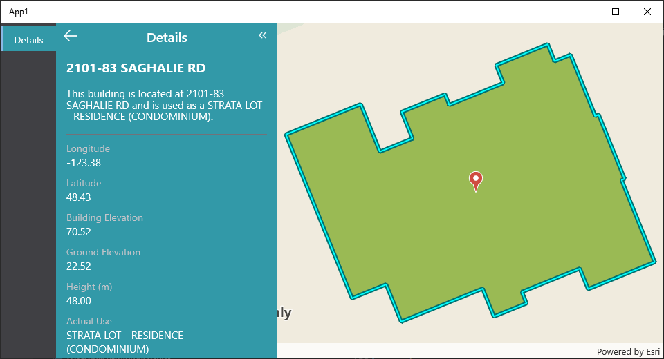
Color primaryBackground;
Color primaryBorder;
Color primaryForeground;
Color primaryForegroundDisabled;
Color secondaryBackground;
Color secondaryBorder;
Color secondaryForeground;
Color tabPrimaryForeground;
Color tabSecondaryForeground;
Relevant SDK Sample
The VertiGIS Studio Mobile SDK Samples has an example of configuring the theme with the branding service.